Freedom Begins Today
Mobile UX/UI Design

Duration
February 5 - March 11, 2021
My Role
User Research
Developing User Persona
Wireframe
Conducting Usability Test
User Interface
01
Overview
What is Freedom Begins Today?
Freedom Begins Today is a non-profit organization, intended to help the bonded laborers; bonded labor is also known as 'debt slavery,' where the worker is forced to work under the person who holds the debt.
The main purpose of the application is to educate users about bonded labor, earn donations from the users, and report any suspicious labor activities. The application is intended to target the audience who are willing to learn more about bonded labor and help those laborers.
My goal was to:
1. Make it easy to navigate through the application
2. Inform donors of funds' usage and purpose
3. Create an educational environment related to labor and rights
02
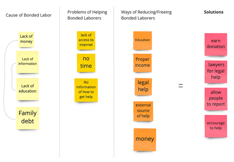
What is the Problem?
POV - Point of View
“Bonded laborers should be helped because they do not have access to information and help."
HMW - How Might We
“How might we help the bonded laborers so that they could be free from bonded labor and prevent from falling back in?”
03
Users and Target Audience
Who is the target audience?
-
Age: 20 - 30
-
Gender: All genders
-
Status: Working
Persona
Martin Mai
"I want to live my life freely, without being overworked and underpaid."
ABOUT
PERSONALITY
-
Age: 28
-
Work: Farmer
-
Status: Has been working for 13 years
-
Family: Family of 3, single child
Eager
Passionate
Adventurous
Honest
GOAL
-
Report his situation to organizations that could help him
-
Bring awareness and inform what is bonded laborers and what is happening to them

BIO
Martin is a 28 year old bonded laborer, who has been working at the same farm for over 10 years. He came to the United States at the age of 15 and has been working ever since to help out his family. During his earlier days, he worked without asking why he always works so hard. However, he found out that other farm workers work much less than he does while received more money than him. So, he now wants to find out more information about his situation, tell the exterior world what he has been experiencing, and report his farm owners.
04
Ideation Process
Affinity Mapping
Sketches & User Flow Wireframes


First Prototype

The primary focus of the first prototype was to educate bonded labors about their rights and to allow them to connect with the lawyers to receive legal help. There are two flows that are currently showing in the image above; one is learning about what a pro bono lawyer is and another one is to connect.
05
First Round of User Test
User Test Process:
-
4 user testers
-
Tasks: finding ‘Jannet Jones’ lawyer and messaging & finding information about minimum wage
User Test Finding:
-
Confused about what is the difference between ‘Community’ and ‘Connect’ function
-
The chatting room does not seem like an active room —> not sure what to send first
-
Want to have constant access to messaging function
-
Like the motion of pushing to delete the chat
-
Easy to navigate
Changes
Color Palette

> Simplified color palette <
Sign In / Create Account


> Simplified log in process <
Home Page

> Home page that serves the purpose as the "Information Page," and displays three features of "About Us," "Donate," and "Report" functions <
06
Second Round of User Test
User Test Process:
-
3 user testers
-
Main purpose of this testing was to see whether the chatting function is necessary and what the users think about the ‘donation’ process.
User Test Finding:
-
Followed the task to make a donation, but all of the users stated that they want to know more information about the organization before making a donation
-
Chatting seems unnecessary anymore because the target audience is no longer bonded laborer themselves
-
The carousel format of information is useful, but hope to see more about each information
-
Color seems more appropriate to the theme
-
Purpose of the application is unclear
Changes
Onboarding (new)


> Displays what the users can do with the application <
Donation (new)

> Carousel of information about where and how the donated funds will be utilized <

> Users are able to decide whether they want to donate once or frequently through out the week, month, or year.
The button for making the donation changed from a green check mark to the button that says "donate" in order to clarify what action they are about to do. <
Report

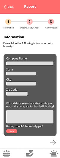


> Verifies and values users' voice, with the breadcrumb menu to help users gauge where they are in the process <
07
Final Prototype


Onboarding
Home / Information
Donation
Report
08
Takeaways
Through this project, I was able to learn
-
The importance of having a clear target audience
-
having an audience that was harder to incorporate (i.e. pro bon lawyers) changed what features that I would have in the app
-
-
The importance of user testing and feedback
-
conducting user tests and receiving feedback from fellow designers helped me view small inconveniences that I have missed and it was also interesting to fix those small details and resulted in a more deliberate application
-
09
Link
